Industry news

What Is Mobile-First Indexing and Is Your Site Ready?

Google now indexes and ranks the mobile version of your pages. What mobile-first indexing means, what must match on mobile, and how to check your site.

FindSEO7 min read

A man at a wooden desk holds a smartphone in one hand while his other hand rests on the keyboard of an open laptop, with a notebook and coffee cup nearby.

Photo: Alejandro Escamilla / Wikimedia Commons (CC0)

In this article
  1. What is mobile-first indexing?
  2. When did mobile-first indexing happen?
  3. Why does it still matter if the switch is finished?
  4. Which mobile setup is best for SEO?
  5. What must match on mobile and desktop?
  6. Is mobile-friendliness a ranking factor?
  7. How do you check your site is ready?
  8. Mobile-first indexing checklist
  9. The bottom line

Mobile-first indexing means Google uses the mobile version of your pages, crawled with its smartphone crawler, for indexing and ranking. Google's mobile-first indexing best practices say so plainly, and in October 2023 Google announced that the move to mobile-first indexing was complete. So if something is missing from your mobile pages, Google treats it as missing from your site. You don't need a separate mobile site, but your mobile pages need the same content, headings, metadata and structured data as your desktop pages, and Googlebot must be able to load them.

This guide explains what changed, why it still causes problems in 2026, and how to check your own site.

What is mobile-first indexing?

It's about which version of a page Google reads. Before the change, Google's systems mostly looked at the desktop version of a page. When Google first announced mobile-first indexing experiments in 2016, it explained the problem: most people searched on phones, but rankings were still based on desktop content, which caused issues when a mobile page had less on it.

Three points are often misunderstood:

  1. There's one index, not two. When the rollout began, Google said it had no separate "mobile-first index". The same index serves desktop and mobile searchers. It's just built from mobile pages.
  2. It's about how content is gathered, not a ranking bonus. In the same post, Google said content gathered this way has no ranking advantage of its own.
  3. Desktop searchers see results built from your mobile content too. If your mobile pages are thin, both audiences are affected.

If you're new to how Google finds and stores pages, our Academy lesson on how search engines work covers crawling and indexing from the start, and our glossary entry on mobile-first indexing gives the short version.

A woman in a red checked hoodie scrolls on her smartphone while waiting on a train station platform.
Google builds its index from the version of your page that people like this see. Photo: Daria Nepriakhina, CC0, via Wikimedia Commons.

When did mobile-first indexing happen?

Slowly, over seven years. Google started moving sites in March 2018, and it made mobile-first indexing the default for websites new to Google Search from 1 July 2019. It then planned to switch every site in September 2020, before extending the deadline to the end of March 2021. The final announcement came on 31 October 2023.
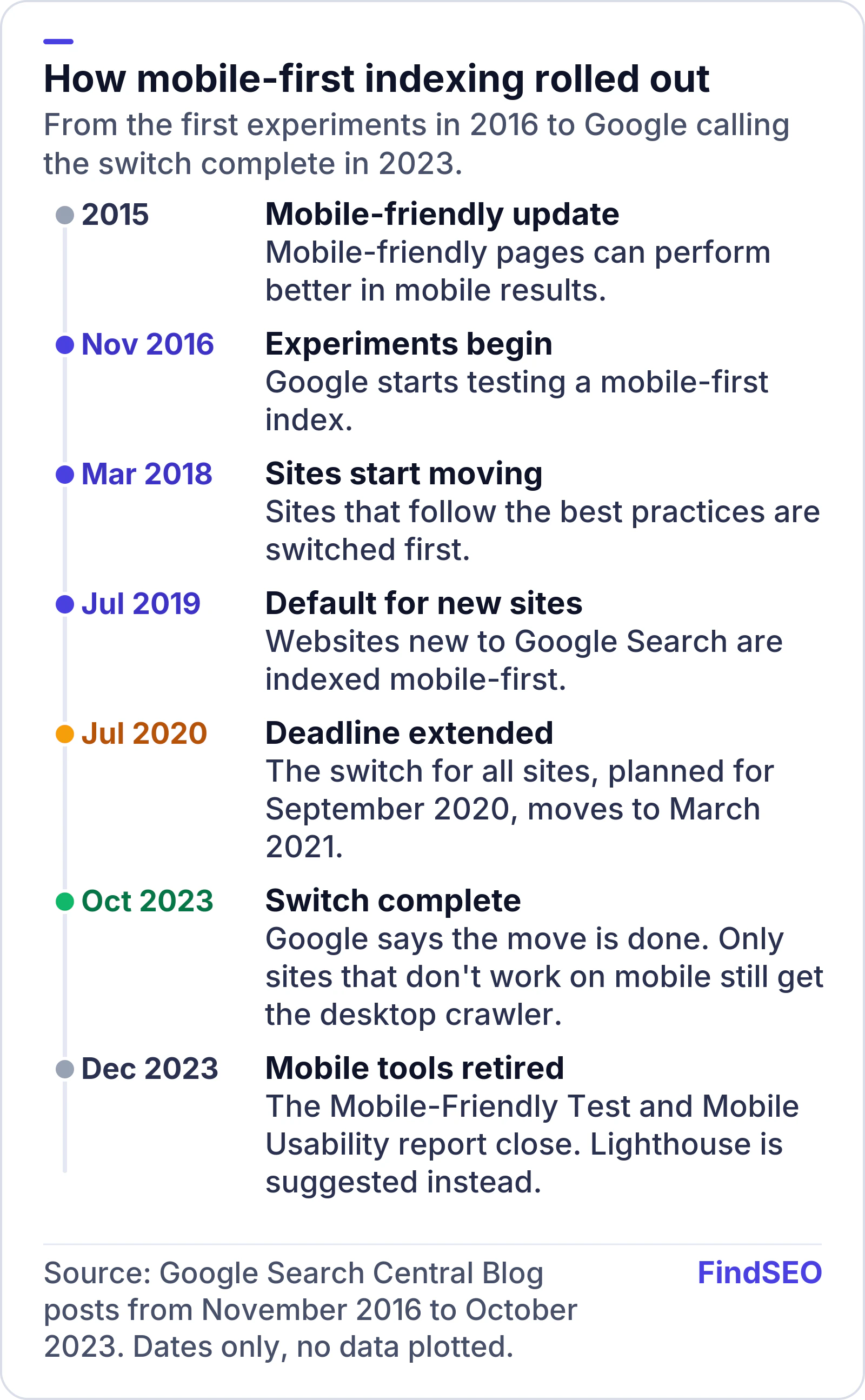
Timeline of how mobile-first indexing rolled out, from Google Search Central Blog posts. 2015: the mobile-friendly update helps mobile-friendly pages in mobile results. November 2016: Google starts testing a mobile-first index. March 2018: sites that follow best practices start moving. July 2019: mobile-first becomes the default for sites new to Google. July 2020: the switch for all sites, planned for September 2020, moves to March 2021. October 2023: Google says the switch is complete. December 2023: the Mobile-Friendly Test and Mobile Usability report are retired.
The switch took seven years and is now finished. Dates from Google Search Central Blog posts, 2016 to 2023.

Even now, Google still runs a desktop crawler. Its Googlebot documentation says most crawl requests come from Googlebot Smartphone and a minority from Googlebot Desktop. In its 2023 post, Google said it would keep crawling a very small set of sites that don't work on mobile at all with the desktop crawler. The usual causes were pages that show errors to every mobile user, a mobile site blocked in robots.txt while the desktop site was open, or every mobile page redirecting to the homepage. That fallback is for broken mobile sites. Don't plan around it.

Why does it still matter if the switch is finished?

Because the risk is in what your mobile pages leave out, and that can change with every redesign. Google's best practices are blunt: if your mobile page has less content than your desktop page, expect some traffic loss, because "only the content shown on the mobile site is used for indexing."

Common ways businesses lose content on mobile:

  1. Trimmed mobile templates that drop text, reviews, FAQs or internal links to make pages shorter.
  2. Content that loads only on a tap or swipe. Google's guide to fixing lazy-loaded content says Google Search doesn't interact with your page, so content must load when it's visible in the viewport.
  3. Different robots meta tags on mobile. A stray noindex on the mobile template can stop pages being indexed.
  4. Missing structured data on the mobile version, which can cost you rich results. Our Academy lesson on structured data basics explains what to include.
  5. Blocked resources. If mobile CSS, JavaScript or images sit on different URLs that robots.txt blocks, Google can't render the page properly.

Moving content into accordions or tabs is fine. Google says you can use a different design on mobile as long as the content is equivalent. Removing it is the problem.

Which mobile setup is best for SEO?

Google supports three ways to serve mobile pages, and recommends one of them.

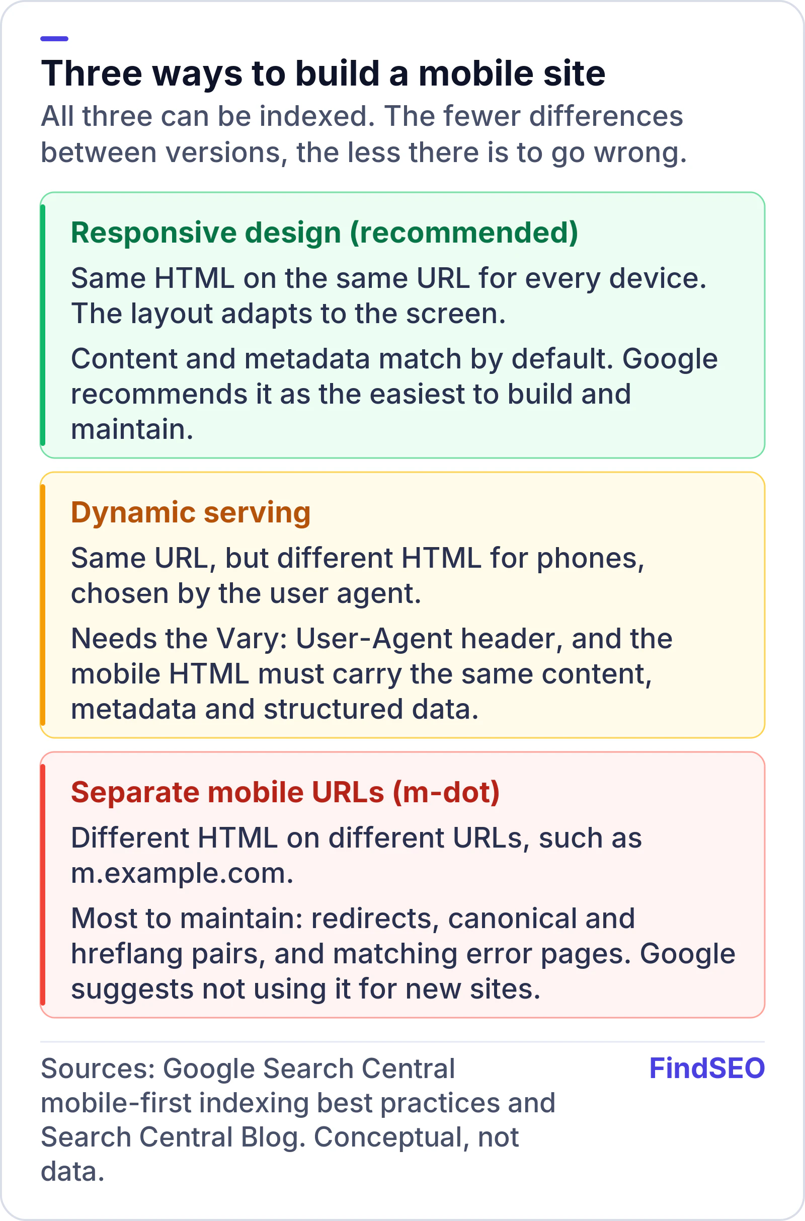
Conceptual comparison of three ways to build a mobile site. Responsive design, recommended: same HTML on the same URL for every device, so content and metadata match by default. Dynamic serving: same URL with different HTML chosen by user agent, which needs the Vary User-Agent header and matching content, metadata and structured data. Separate mobile URLs (m-dot): different HTML on different URLs, the most to maintain, and Google suggests not using it for new sites.
Responsive design removes most mobile-first risks because there's only one version of each page. Conceptual comparison, based on Google Search Central guidance.

Responsive design serves the same HTML on the same URL and changes the layout with CSS. Google calls it the easiest pattern to build and maintain, and web.dev's responsive web design basics explain the viewport tag and flexible layouts behind it. Since 2020 Google has recommended responsive design for new websites and suggested avoiding separate m-dot URLs because of the confusion they cause.

If you already run separate mobile URLs, you need extra care: matching error pages, no indexable content behind URL fragments, and canonical tags and hreflang tags that pair mobile and desktop URLs correctly. Moving to responsive design is a site migration, so follow a plan like our guide to migrating a website without losing SEO.

What must match on mobile and desktop?

Google's best practices list what to keep equivalent. Use this as a parity check:

Element What to check on mobile
Main content Same text, images, videos and links as desktop
Headings Same clear, meaningful headings
Title and meta description Equivalent on both versions
Robots meta tags Same tags, with no extra noindex or nofollow
Structured data Same types and properties, with mobile URLs on m-dot sites
Images Same alt text, captions and file names, with stable image URLs
Lazy-loaded content Loads when visible, without a tap or swipe

Images deserve a second look. Google recommends the same alt text on mobile and desktop and warns against image URLs that change on every load. Our guide to image SEO covers the rest.

Close-up of two hands in low light, one thumb tapping the screen of a smartphone.
If content only appears after a tap, Googlebot may never see it. Photo: Gilles Lambert, CC0, via Wikimedia Commons.

Is mobile-friendliness a ranking factor?

Mobile-first indexing and mobile-friendliness are different things. Indexing is about which version Google reads. Mobile-friendliness is about whether that version is easy to use. Google's page experience guidance asks site owners to check that pages are mobile-friendly, along with good Core Web Vitals, HTTPS and no intrusive interstitials. Google says its core ranking systems look at signals that align with overall page experience, but relevance still comes first. Our article on whether Core Web Vitals affect rankings explains how much weight to give them.

One thing that has gone: Google retired the Mobile-Friendly Test and Search Console's Mobile Usability report from 1 December 2023, saying mobile usability still matters and pointing to tools such as Lighthouse instead. If an agency report still quotes a "Mobile-Friendly Test pass", ask what it actually tested.

How do you check your site is ready?

Use free tools and check the pages that earn you money first: the homepage, top service pages and best-selling products.

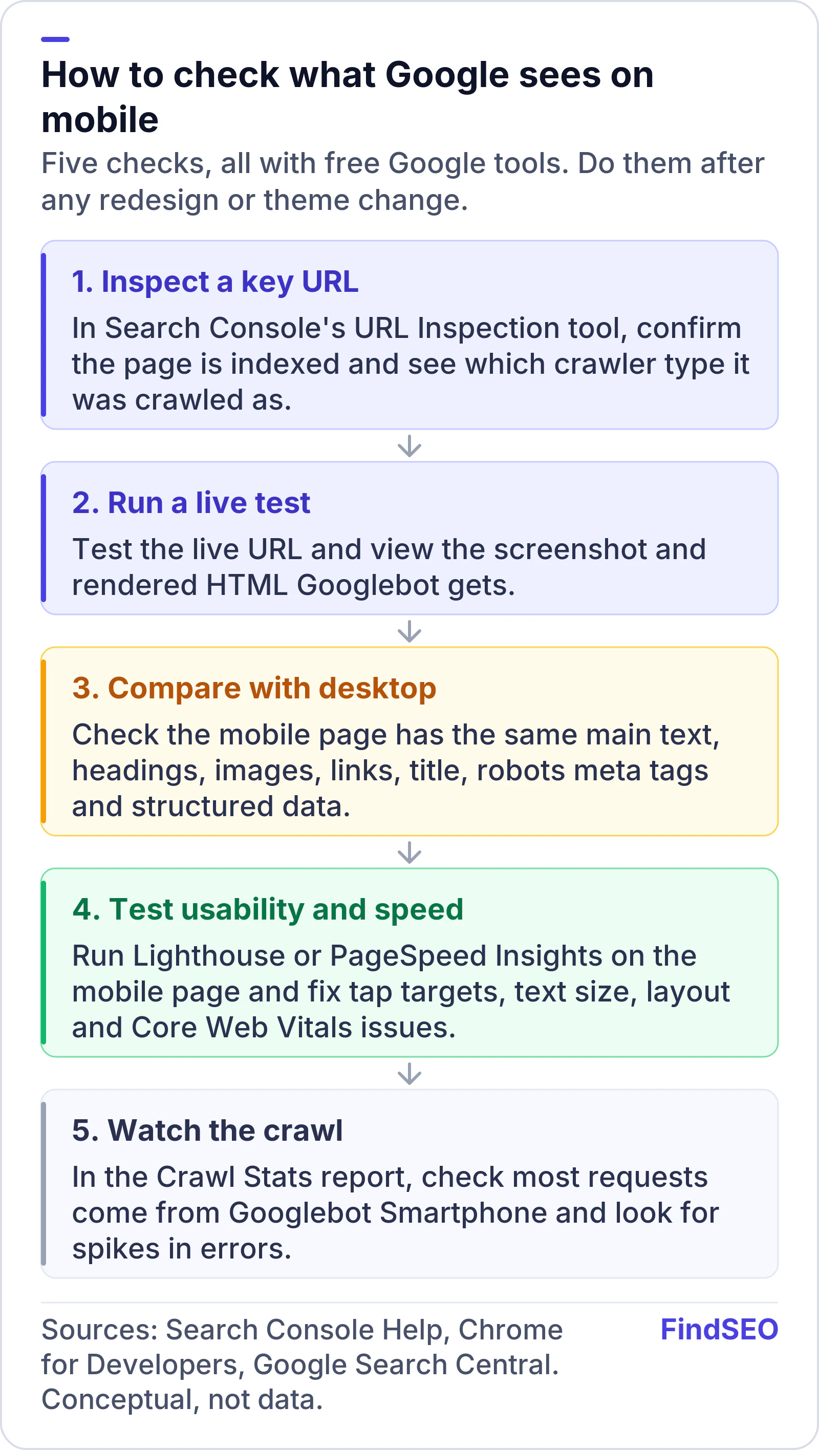
Conceptual five-step process to check what Google sees on mobile: 1, inspect a key URL in Search Console's URL Inspection tool to confirm it's indexed and see which crawler type it was crawled as; 2, run a live test and view the screenshot and rendered HTML; 3, compare the mobile page with desktop for main text, headings, images, links, title, robots meta tags and structured data; 4, run Lighthouse or PageSpeed Insights and fix tap targets, text size, layout and Core Web Vitals; 5, check the Crawl Stats report shows most requests from Googlebot Smartphone.
Run these five checks after any redesign, theme change or new page template. Conceptual process based on Google's documentation.
  1. Inspect key URLs. Search Console's URL Inspection tool shows whether a page is indexed and which crawler it was "crawled as." If you haven't connected your site yet, start with our guide to setting up Google Search Console.
  2. Run a live test. The live test shows a screenshot and the rendered HTML, so you can see whether content, menus and reviews actually load.
  3. Compare with desktop. Work through the parity table above. Our free Google index checker is a quick way to spot important pages that aren't indexed at all, and our guide to why a page isn't indexed helps you find the cause.
  4. Test usability and speed. Lighthouse runs audits for performance, accessibility and SEO in Chrome DevTools. Check text size and tap targets: the W3C's target size guidance sets a minimum of 24 by 24 CSS pixels for accessibility.
  5. Watch the crawl. The Crawl Stats report breaks requests down by Googlebot type. Most should come from the smartphone crawler.

Problems found here belong in any technical SEO audit. If you'd rather hand it over, compare technical SEO agencies in Australia or browse the agency directory.

Mobile-first indexing checklist

  • Your site uses responsive design, or you've checked every mobile template against desktop.
  • Mobile pages carry the same main text, images, videos and links as desktop.
  • Headings, titles and meta descriptions match.
  • Robots meta tags are identical, with no stray noindex on mobile.
  • Structured data is present on the mobile version.
  • Images use the same alt text and stable URLs.
  • Lazy-loaded content appears without a tap or swipe.
  • Robots.txt doesn't block mobile CSS, JavaScript or images.
  • Key URLs pass a live test in URL Inspection.
  • Lighthouse shows no major mobile usability or speed problems.
  • Crawl Stats show most requests from Googlebot Smartphone.

The bottom line

Mobile-first indexing isn't a coming change. It's how Google has indexed the web since the switch finished in 2023. Whatever your mobile pages show is what Google ranks, for mobile and desktop searchers alike. Responsive design makes that simple, because there's only one version of each page. Check your top pages with URL Inspection and Lighthouse after every redesign, and ask any agency you hire how they test the mobile version. If you need help, get matched with an SEO agency that does technical work, and use the SEO ROI calculator to size up the fix.

FAQs

Does Google still use desktop pages for ranking?

Mostly not. Google uses the mobile version of a page, crawled with Googlebot Smartphone, for indexing and ranking. It still crawls some pages with its desktop crawler, and in 2023 it said it would keep using the desktop crawler for a very small set of sites that don't work on mobile at all.

Do I need a separate mobile website for mobile-first indexing?

No. Google recommends responsive design, which serves the same HTML on the same URL to every device. Separate mobile URLs still work but are harder to maintain, and Google suggests not using them for new sites.

Is content hidden in tabs or accordions on mobile still indexed?

Yes, as long as it's in the page. Google says you can move content into accordions or tabs on mobile to save space, provided the content is equivalent to desktop. Content that only loads after a tap or swipe is the risk, because Googlebot doesn't interact with pages.

How do I check whether my site is indexed mobile-first?

Open Search Console's URL Inspection tool for a key page and look at the crawled as value, then check the Crawl Stats report for the share of requests from Googlebot Smartphone. Google switched every site that works on mobile by October 2023.

What replaced Google's Mobile-Friendly Test?

Google retired the Mobile-Friendly Test and Search Console's Mobile Usability report from 1 December 2023. It pointed site owners to other tools such as Lighthouse in Chrome, and URL Inspection's live test still shows how Googlebot renders a page.

Sources

Ready for help with SEO?

Compare SEO-only agencies near you, with client reviews checked by a person, or tell us what you need and get matched.